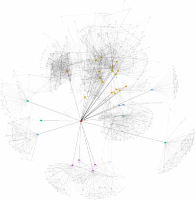
As of 1:00pm on Friday, December 26, my Friendster network viewed several tiers (friend of a friend, etc.) deep looks something like this:

WARNING: Clicking this image will take you to a 650kb 4000x4088 png (reduced from a full-resolution 8520x8708 original). Some browser/computer combinations will choke on an image this size. If you're having problems, save the file and check it out with a dedicated image viewer.
Red = me
Green = people I met in high school
Orange = people I met in college
Purple = people I met in grad. school
Blue = people I met everywhere else
Fun fact: I have 2nd tier contacts who are friends, even though the 1st tier contacts have never met, and have probably never been within 500 miles of eachother. I guess that's the beauty of Friendster.
If you'd like to make your own Friendster map, you'll find the tools and a brief explanation on this page. So that you have an idea of how to add formatting (like color), the neato file I used to generate the graph is here, and the relevant documentation is here.
PS - I'm fascinated by social mapping, so if anyone else makes one of these, I'd love to see it.
Posted on December 26, 2003 11:00 PMPartly, that's because you guys are the only ones to really get into Friendster.
But it's also because you rock out with your lox out.
jacob, next time you're in my neck of the woods remind me to show you the incest chart we made once of who-all made out in high school. it's mighty complex. also, icky.
Posted by: didofoot on December 28, 2003 11:09 AM